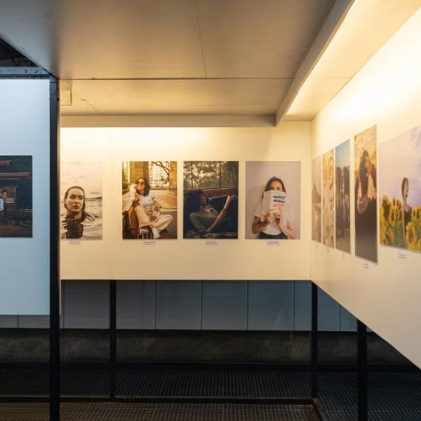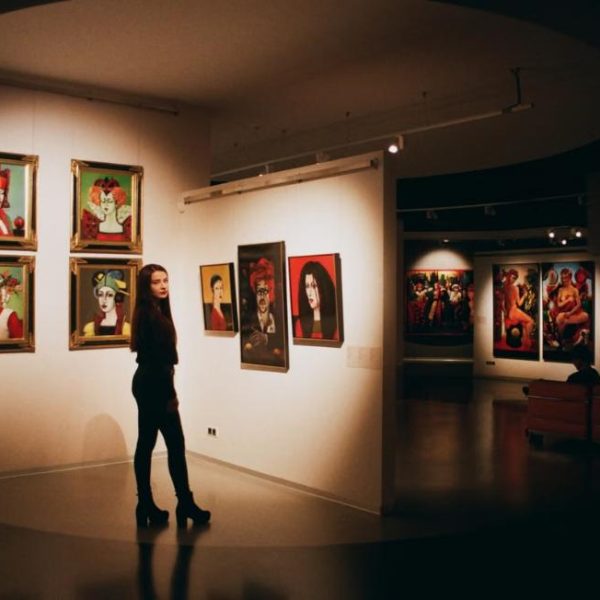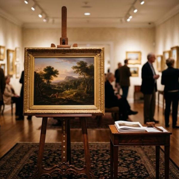
Walk through any photo exhibition and you will notice something: the images that stay with you usually have a clear, controlled use of color. A great portrait is built a bit like a painting. The colors of the clothes, the skin, the background and the light all work together. Family photographers think about this every day, and it is why many of them send clients a style guide before a session. At the center of that guide is a simple idea, the family photo color schemes that tie a group together.
You do not need an art degree to use the same approach. Here is how photographers think about color, and how you can build a palette that works for your own family.
Why Color Matters So Much in a Family Portrait
Our eyes are drawn to the brightest and most saturated color in a picture. If one person wears a bright red sweater and everyone else wears soft blues, the eye goes to the red sweater first, before it reaches anyone's face. That is not always bad, but it should be a choice, not an accident.
A good color scheme does two jobs. It makes the family look like a unit, and it lets the viewer's eye move easily from face to face. When colors clash or compete, the photo feels busy, even if every person looks lovely on their own.
The Basic Color Rules Photographers Use
Most photographers lean on a few simple ideas from color theory. The most useful tool is the color wheel, which arranges colors in a circle so you can see how they relate. From there, three classic approaches cover almost every family photo:
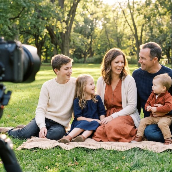
- Complementary: colors that sit opposite each other, like blue and orange or green and red. Complementary colors create energy and contrast. In family photos, use muted versions, such as navy with rust.
- Analogous: colors that sit side by side, like blue, teal and green. They feel calm and harmonious.
- Monochrome: different shades of one color, like light blue, dusty blue and navy. This looks elegant and very pulled together.
Start With the Location's Colors
Here is the part many families miss. The background is part of the color scheme. A photographer will look at the setting first and pick clothing colors that work with it.
- Green park or forest: warm tones like rust, mustard, cream and burgundy stand out against green.
- Beach: soft blues, whites and sandy neutrals blend with the sea and sky for a calm look.
- Golden fall leaves: deeper and cooler shades, like navy and teal, help people stand out.
- Studio with a plain backdrop: almost any palette works, so you can be bolder.
Pick a Lead Color, a Support Color and Neutrals
Interior designers often use a 60-30-10 rule for rooms, and it works well for families too. Roughly 60 percent of the clothing is a neutral, such as cream, gray, tan or denim. About 30 percent is a support color. The last 10 percent is a lead color that adds a spark. For example, a family might wear mostly cream and denim, with dusty blue as the support color and a little mustard as the accent.
This structure keeps the group balanced. It also makes shopping easier, since most of the clothes are neutrals that people already own. For a practical walk-through on coordinating colors for a family photoshoot, including patterns, textures and layers, this guide explains each step in plain language.
Five Family Photo Color Schemes That Work
- Navy, cream and rust: warm and classic, great for fall and outdoor sessions.
- Sage, cream and tan: soft and natural, lovely for spring and newborn sessions.
- Dusty blue, white and gray: fresh and calm, ideal for the beach.
- Burgundy, mustard and olive: rich and seasonal, perfect for autumn leaves.
- Blush, cream and light denim: gentle and bright, good for sunny fields and gardens.
Test Your Palette Before the Shoot
Photographers often ask families to send a photo of their outfits laid out together. You can do this yourself. Put every outfit on the bed or floor, side by side, and take a picture with your phone. Look at it small, as if it were a thumbnail. Does one item jump out too much? Does anything blend into the background color of your location?
Then switch the photo to black and white. This shows contrast. If everything turns into the same gray, add a lighter or darker piece so people do not merge together in the final image.
Colors Photographers Often Ask You to Avoid
- Neon shades: they reflect colored light onto skin and are hard to correct.
- Large areas of pure white or black: they can lose detail in bright sun or deep shade.
- Logos and printed words: they pull attention away from faces.
- Tiny stripes and checks: they can create a shimmering effect on camera.
Think Like a Photographer
The secret behind beautiful family portraits is rarely expensive clothing. It is a clear plan for color. Start with the location, choose a simple scheme from the color wheel, balance neutrals with one or two colors and test it before the day. When you think about color the way photographers do, your family photos start to look less like snapshots and more like art you will want to hang on the wall.